Graphic Design

The following selection of graphic design works has been curated from my portfolio to provide an overview of my abilities and style as a designer. These works have been created over the past year and have been chosen for their representation of my technical skills, design aesthetic and understanding of the client's needs. Each project highlights my proficiency in creating visually pleasing designs, effective execution and ability to communicate a message effectively. These works also demonstrate my ability to adapt and evolve as a designer, providing an insight into my growth and development over the past year. The goal of presenting these works is to provide an objective understanding of my capabilities as a graphic designer and to demonstrate my ability to produce high-quality and effective graphics.


Vormgeving 1
As a Graphic Design student, my first assignment required me to create a digital mockup of a one-page website, emulating the style of a chosen influential graphic designer. I was assigned Jurriaan Schrofer, who is renowned for his unique
and creative use of typography to create abstract and geometric designs.
The images displayed here are all my own work and demonstrate the final design, along with a design rationale that documents my progress throughout the
assignment. The design rationale includes various sketches and iterations that I went through in the process of creating the final design. Additionally, the stylesheet that is included, provides a detailed insight into various aspects
of the design such as the color palette that was used, the typography and other design elements that were used to create the final design
Files
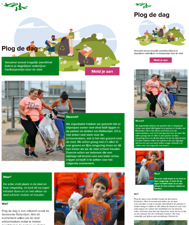
Vormgeving 2
I recently completed a website prototype for an environmental campaign by the municipality of Rotterdam. The city has strict guidelines for their corporate identity which made it challenging to incorporate creativity into the design. However,
through research and understanding of the requirements, I was able to deliver a mockup that met the guidelines while still being visually pleasing. This design is responsive and has multiple layouts in accordance with the viewport
of the end user.
The mockup that's displayed here has gone through several iterations and sketches until the displayed layout was chosen as the final design.
Files

Visual Interface Design
For the course Visual Interface Design, I was assigned to create an iPad app that would assist middle school students in discovering books for their mandatory reading list. The app was a collaborative project between the Municipality of Amsterdam and the local library. The app was designed to be user-friendly and engaging to encourage students to read more. The work I have chosen to present includes primarily screenshots of the final prototype and the cover of the process book that illustrates the multiple iterations of the prototype's development, including design and functionality choices made throughout the development process.